By Eleanor Ruth
People usually prefer old streets to new ones.
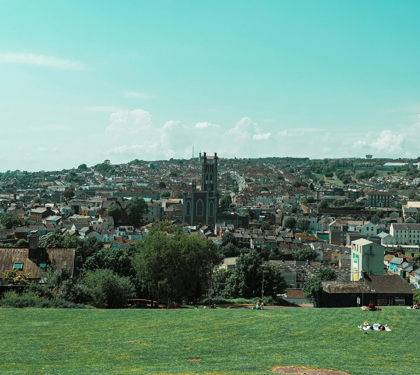
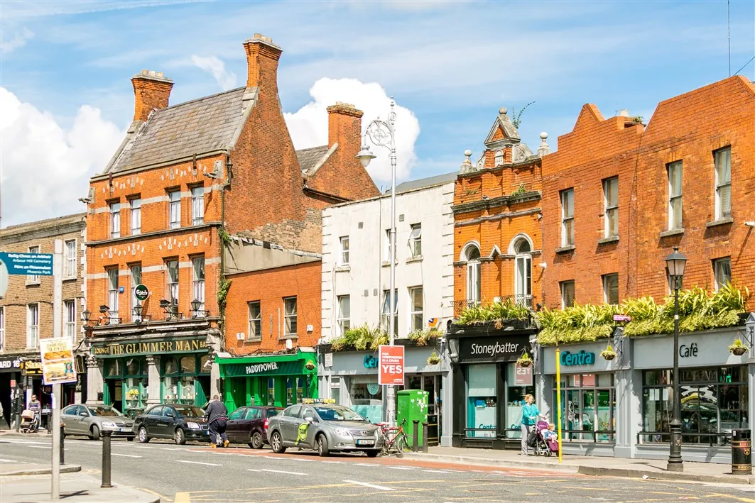
Walk through Stoneybatter in Dublin or O’Connell Avenue in Limerick and it’s easy to see why. The complementary brick terraces alongside the tight rhythm of shopfronts create the sense of being held by the street.
Compare these places to the mismatching housing estates built in the last fifteen years. The contrast seems to confirm the thesis: new is worse; old is better; something has been lost.
But perhaps this is nostalgia, dressed up as analysis. Plenty of old streets are dreadful. Dorset Street in Dublin is Victorian yet it feels like a motorway with shopfronts. The quays along much of the Liffey are Georgian in origin and deeply unpleasant to walk.
Meanwhile some recent developments hold together perfectly well, such as the regeneration of Smithfield, or parts of the Grangegorman campus in North Dublin. It can’t all be about age. Something else must be going on.

When someone says a street is “nice”, they are rarely talking about architecture in any specific sense. They mean something more immediate: I can read this place. It makes sense. I want to stay.
These are descriptions of a cognitive experience rather than of taste or aesthetic preference. They describe how easily the brain can process what the eyes are delivering.
A street that works perceptually is one where we can compress a complex scene into a manageable pattern without strain. A street that fails is one where every building, sign, and surface demands individual processing, flooding the brain with unresolved information. The first feels restful. The second feels exhausting. And the difference between them is not a matter of opinion, it is measurable, testable, and well understood.
How we read a scene
Our brains are pattern-seeking machines. They apply a consistent set of rules, known as Gestalt principles, to every visual scene we encounter.
These rules, first identified by German psychologists Max Wertheimer, Kurt Koffka, and Wolfgang Köhler in the early twentieth century, describe how we instinctively group, complete, and simplify what we see.
These psychologists’ central insight is the law of Prägnanz. The law of Prägnanz says we default to the simplest possible interpretation of any complex scene.
There are seven of these principles: similarity, common fate, proximity, figure-ground, closure, continuation, and symmetry. Ireland offers an unusually rich laboratory for all of them.
What you see before you see it
Before any of these principles can operate, there is a prior question: what can you actually perceive from where you are standing?
Researchers in spatial analysis use a concept called an isovist which is the total area visible from a given point. On a narrow street, the isovist is small and bounded: you see the buildings on both sides, the pavement, and a short stretch ahead. While on a wide boulevard, the isovist expands and the edges of the visual field become harder to resolve. The result is that one street invites you to explore, while another forces you to stare ahead at the distance you must cross. This can make streets of similar lengths feel like dramatically different walks.
Grafton Street and O’Connell Street illustrate the difference. Both are major pedestrian routes in central Dublin, but where Grafton Street is narrow enough that you can read both sides simultaneously, O’Connell Street is roughly three times wider.
On Grafton Street your visual field is bounded, contained, and full of information at a comfortable scale. On O’Connell Street, standing in its centre, the building facades on either side recede beyond the distance at which the brain can easily parse detail. The Spire provides a vertical anchor, but the horizontal edges of the street dissolve. The consequence is that Grafton Street feels intimate and legible while O’Connell Street, for all its grandeur, often feels like a space you cross rather than inhabit.


Width alone does not determine this. Parisian boulevards are wide but feel enclosed because of consistent building heights, mature tree canopies, and active ground-floor frontages that keep the eye engaged at close range. What matters is not just the geometry of a street but how much visual information is available from any given point within it.
What holds a street together
Three of the seven Gestalt principles govern whether a collection of buildings reads as a unified composition or as a group of strangers who happen to share a postcode. They are similarity, common fate, and proximity.
Similarity is simple: we group things that look alike. When buildings share visual features, such as materials, heights, window rhythms, roof profiles, we file them as a group.
However, aesthetic preferences can still be expressed without violating the principle of similarity so long as the underlying architecture is mindful of its surroundings. Cobh’s “Deck of Cards” terrace is beloved precisely for this point: every house is a different colour, yet the identical roof pitches, bay windows, and proportions create such strong formal repetition that the terrace still reads as a unit. Colour individuates what shape unifies.

On the other hand, the approach road into almost any Irish town shows what happens when similarity is absent. You’ll find a filling station, a bungalow, a car dealership, a derelict pub, a new apartment block but no shared material, no common height, and no repeating rhythm. We cannot compress the scene and have to process each building from scratch. As a result, it feels like the approach road never coheres into a place, and so we never register arriving anywhere until the town centre finally asserts itself. It could be the entrance to any town in Ireland.
Common fate governs direction. When buildings follow the same curve, share a cornice line, or align along a common setback, we group them even if they look nothing alike. What matters is not whether buildings match, but whether they feel like they are “going” the same way.
Cork’s St Patrick’s Street was rebuilt after the Burning of 1920, and because the new buildings were constructed within a short period using similar proportions and materials, they follow the street’s natural curve as a unified wall rather than a collection of individual premises. The Salthill Promenade in Galway produces the same effect at a larger scale with the seawall, footpath, road, and building line all tracking the same two-kilometre sweep along the bay.

Proximity is the bluntest of the three principles. The brain groups whatever is close and separates whatever is far apart. Dublin’s Georgian squares were designed around this instinct. On Merrion Square, the terraced houses are built party wall to party wall with no gaps, no driveways, and no setbacks. Each front door is barely three metres from its neighbour and so the brain reads these individual houses as a continuous cliff of brick, a single wall wrapping around a central park. The enclosing effect is so strong that even though the square is open to traffic on all four sides, it still feels like a room.

That sense of enclosure is a direct product of how tightly the buildings are packed. Pull them apart by inserting front gardens, driveways, or side passages and the wall breaks, the room dissolves, and the square stops feeling like a square. That is exactly what happens in most contemporary housing estates. Stand on a typical suburban street built in the last twenty years and the houses are separated by driveways, gable walls, bin storage areas, and parking courts. Each dwelling sits in its own patch of space. The gaps may only be a few metres, but they are enough. The houses themselves often come in three or four different “types” from the developer’s catalogue, oriented at different angles to maximise site coverage, clad in a mix of brick, render, and stone. Similarity dissolves because nothing repeats consistently enough for the brain to group it. Common fate is also ignored because nothing faces the same way. These housing estates fail on all three grouping principles simultaneously. This is why so many new estates feel like collections of objects rather than places, even when the individual houses are perfectly fine.
There is nothing about modern housing estates that must pose an existential issue to these principles, and nothing about Merrion Square’s proximity that requires Georgian architecture. It requires party walls, a consistent building line, and the discipline to leave no gaps. Any era can do that but most new developments choose not to.
What makes a street readable
Two further principles, figure-ground and closure, determine whether the brain can sort a scene into a stable, navigable structure.
Figure-ground is one of the most basic acts of visual interpretation: sorting a scene into objects of attention (figure) and everything behind them (ground). When that sorting is easy (when solids are clearly solid and voids are clearly void) a street feels immediately readable, even to someone encountering it for the first time.
Titanic Belfast, with its angular aluminium shards angled at up to seventy-two degrees against the flat docklands, is figure-ground at maximum contrast. The sharp angles and complementary colour profile force the building into stark relief from its background, making it easy to parse.

The Burren villages of County Clare are the opposite, stone buildings on a stone landscape under a stone-coloured sky, where figure and ground merge and the settlements almost disappear into the karst. Neither is “wrong”, but one is instantly legible and the other requires close attention to understand.

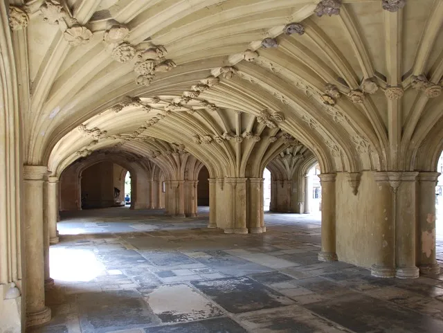
Closure describes our willingness to complete what architecture leaves unfinished. Meeting House Square in Temple Bar is enclosed by buildings on three sides but the fourth side opens onto Eustace Street with only a lightweight canopy overhead. In geometric terms, it is missing a wall yet in perceptual terms, it doesn’t matter. The three existing facades are tall enough and close enough together that the brain fills in the gap and reads the space as a complete outdoor room. In 1991, Group 91 (a temporary consortium of Irish architects) designed it this way deliberately. Closure meant they could create a sense of enclosure without sealing the square off from the surrounding streets.

However, closure collapses when the gaps are too large and the principle of proximity (or lack thereof) takes over. The unfinished ghost estates that appeared across the midlands after the Celtic Tiger with their roads to nowhere, foundations without walls, and walls without roofs are perceptual as well as economic failures. There is not enough visual information for us to close the form, leaving a sense of a landscape of absence rather than a neighbourhood in progress.
What keeps you moving through a street
The final two principles, continuation and symmetry, govern how the eye travels through a scene and whether it comes to rest.
Continuation is the principle that once the eye picks up a line, it resists stopping. When a street offers an unbroken visual path, such as a consistent cornice, a continuous building edge, a row of trees planted at equal intervals, then the gaze follows it automatically, and movement through the space feels effortless. When that path is interrupted, the eye has to reset, and the sensation of flow gives way to friction.
The Long Walk in Galway demonstrates this cleanly, with its quayside promenade, house facades, and the river wall all running in one unbroken trajectory. Where a side lane crosses or a gap appears between buildings, it barely registers. The line is so well established by that point that the eye skips over the interruption and keeps going. You don’t decide to walk to the end of the Long Walk, the street decides for you. The continuation is so strong that turning around feels like a small act of resistance, like stopping mid-sentence.

Symmetry has the biggest and most immediate positive effect on parsing spaces. We resolve balanced compositions faster than unbalanced ones. A facade with a centred entrance and matching wings on either side is processed almost instantly. The original shopfronts on the west side of D’Olier Street in Dublin show symmetry operating at scale. Designed in the early nineteenth century as part of the Wide Streets Commission’s replanning of central Dublin, each shopfront follows the same three-bay pattern: a narrow bay with a door on the left, a wide central bay for displaying goods, and a narrow bay with a door on the right. It’s an A-B-A composition, perfectly mirrored around the centre. Repeated along the full terrace, the rhythm compounds: symmetry within each unit creates a larger symmetry across the whole block. The Commission understood that a commercial street needs to be legible at walking pace, and bilateral symmetry is the fastest way to achieve that.

Cross to the east side of the same street and the effect collapses. The original granite shopfronts have been replaced piecemeal with a modern office entrance here, an oversized plastic fascia there. No two frontages share a rhythm. The symmetry that lets our eyes settle on the west side is gone, and the east side reads as a series of individual interruptions rather than a composed whole. Same street, same width, same sightlines but a completely different perceptual experience depending on which side of the road you walk.
New streets, old rules
None of these belongs to any one historical period. The principles are features of the brain, not of Victorian architecture. Herbert Simms used them in the 1930s with Art Deco flat blocks. Group 91 used them in the 1990s regeneration of Temple Bar, preserving the medieval street lines (continuation), keeping density tight (proximity), using sympathetic materials (similarity), and framing new public squares with clear building edges (figure-ground and closure). The Wide Streets Commission didn’t improve the symmetry and similarity of D’Olier Street because of some inherent importance of symmetry in the early 1900s. Incorporating principles of perception into urban design need not be temporally bound.
Contemporary examples outside Ireland confirm this. In Bordeaux, decades of traffic pollution had darkened the city’s eighteenth-century limestone facades to a uniform grey-black, while changes in industrialisation had left the riverfront as a patchwork of disused warehouses and car parks. Beginning in the 1990s, the city pressure-washed the limestone back to its original pale cream and redesigned the quays along the Garonne. The effect on similarity was immediate: streets that had looked like a jumble of different materials turned out to be the same stone all along, and the restored uniformity made whole quartiers read as single compositions for the first time in decades. Along the river, the industrial voids were replaced with a continuous promenade, lawns, and shallow reflecting pools that now track the waterfront in one unbroken line, improving continuation and proximity.

Nordhavn in Copenhagen is a former industrial port currently in the process of being transformed into a new neighbourhood for 40,000 residents. The masterplan, designed by COBE architects, allows different firms to design individual buildings so the architectural expression varies from block to block but requires them all to hold a continuous street edge. The district now feels coherent without feeling uniform. Continuation is achieved through the unbroken building edges that form the streets, closure through the courtyard blocks that create enclosed outdoor rooms, proximity through the deliberately tight spacing, and similarity through the shared scale and density even as the cladding materials vary from building to building.


These principles can be satisfied by any coherent architectural style, in any material, from any era. What matters is whether the design accounts for how the brain reads the resulting scene.
What this means for how Ireland builds
The principles laid out here describe measurable, testable features of the built environment: material consistency, cornice alignment, building setback, frontage continuity, enclosure ratio. On any real street, they overlap, reinforce, and occasionally contradict each other. The most successful Irish streetscapes tend to be those where multiple principles work in concert.
These streets were not accidents. Ireland’s urban environments have been shaped by planners who understood these principles and by circumstances that ignored them. The Georgian squares were designed with similarity, symmetry, and continuation in mind. The approach roads into Irish towns were not designed at all, and it shows. Between those extremes lies the whole texture of Irish urban life and the invisible rules that determine, before we have consciously registered a single building, whether a place feels like it was made for us.
Ireland is building more homes currently than at any point since the financial crisis. The opportunity that presents itself now is not just to build more streets, but to use these principles as the basis to build ones that people actually want to be on.
Last updated: